District Bank Headquarters
1969
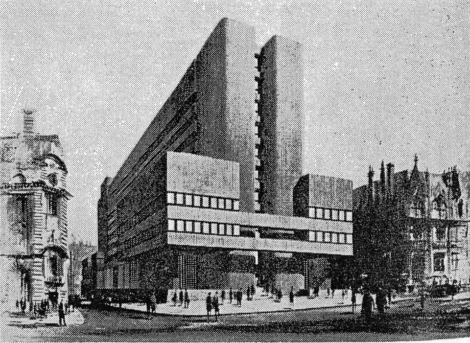
King Street is fast approaching the end of its typologically distinct function as the financial centre of the city. As Lloyds, the last of the great Victorian banking halls, clings precariously to its original programme in the age of self-service, telephone and internet transactions and Edwin Lutyens’ former Midland Bank is transformed into Jamie Oliver’s northern gastronomic outpost, it is perhaps pertinent to consider the most distinctly modern of these spaces, vanished without much noise in the early 1990s. The head office building for District Bank (later NatWest) was proposed under the auspices of a limited competition in 1963. Invited entrants included Manchester stalwarts Cruickshank and Seward and H.S. Fairhurst & Sons, though neither of these local practices actually submitted a design. The jury of two was undoubtedly of the old order; the recently retired Manchester City Architect, Leonard Cecil Howitt, who designed in the civilised ‘Festival’ style and Sir Basil Spence, former RIBA President, often criticised for his picturesque approach to architectural composition. It could be argued that these two were not necessarily ideologically aligned with the rapidly shifting cultural context of the 1960s, but that their collective experience and gravitas was prerequisite to judging the scheme to be sited opposite Cockerell’s Bank of England and adjacent Heathcote’s Lloyds.
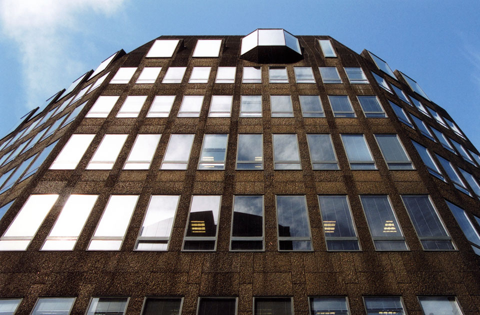
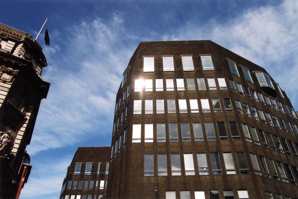
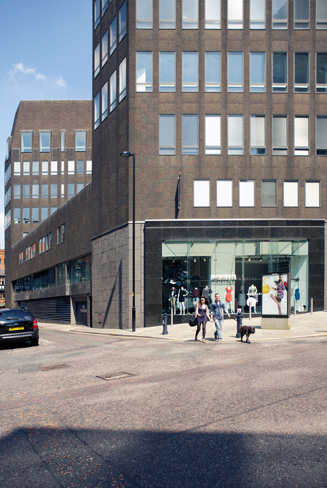
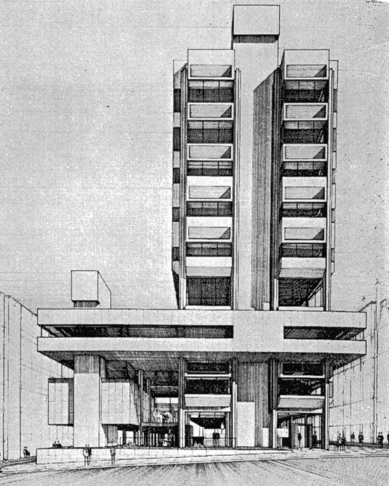
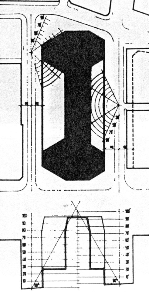
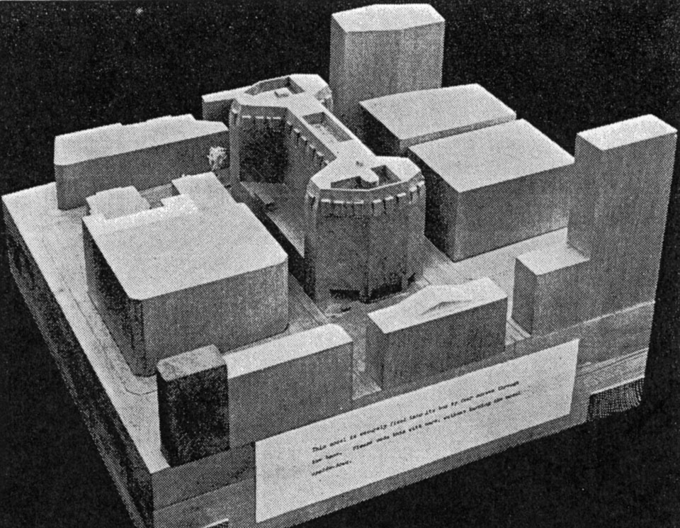
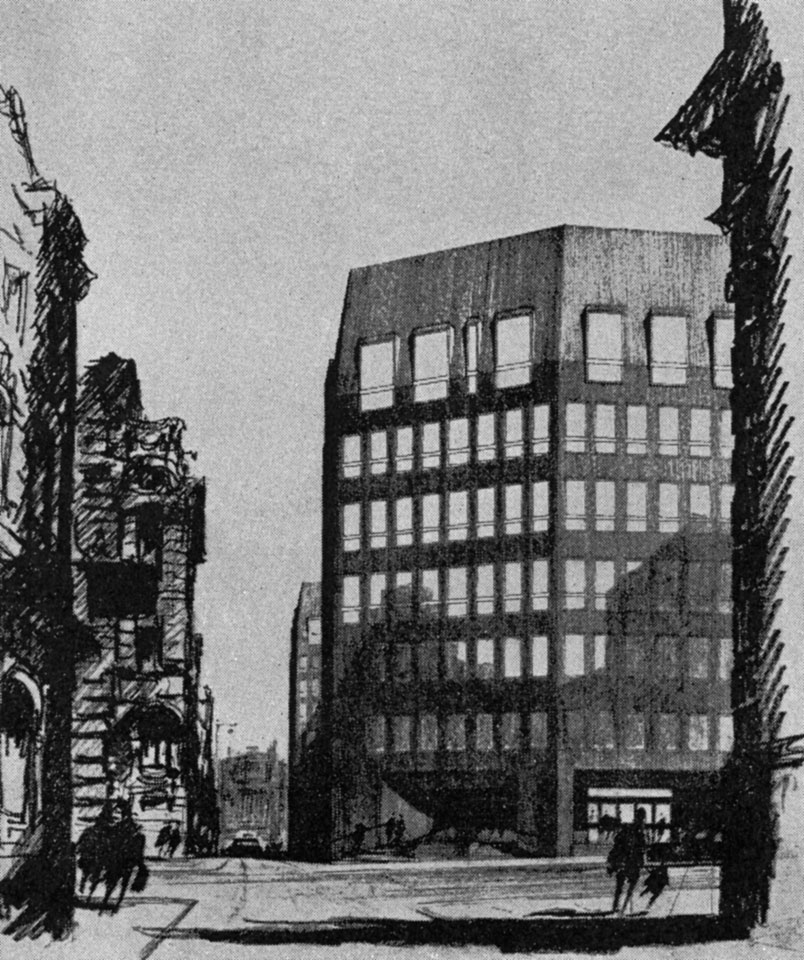
The notion of ‘grandeur’ in Mancunian architecture had been prevalent since the 1860s and Casson and Conder cited ‘grandeur, discipline, toughness and dignity’ as of Manchester and as the qualities that should be sought for this, the winning, scheme. The incised and tapering form had been generated by a study of rights of light in adjacent streets and buildings and likened by Casson himself to a ‘lump of coal’, whilst referred to by others as ‘chrysalid’. This formal justification was rudely subverted when, post-competition, the client acquired additional land that facilitated the repositioning of the building. Nonetheless, its siting was still critical to the planners at the time who insisted that the gap between this and the adjacent Pall Mall Court (Brett and Pollen, 1969) was maintained, to preserve a view of the Town Hall clock tower from Chapel Walks. This vista was eventually closed as the Bank of England building was remodelled to act as a foyer for the new office tower appended to it (Holford Associates, 1995). Lining the external façade is a hand-tooled, vertically ribbed, dark cladding of Swedish granite, reminiscent of their more celebrated work, the Elephant House at London Zoo. It was deliberately specified to absorb the soot that still clung to the city’s buildings. It was also felt that the dark material brought an appropriate austerity to the bank’s northern HQ and formed an intense counterpoint to the ‘hard brilliance’ of the glowing white interior which was designed to promote the sensation of being carved from the ‘solid’.
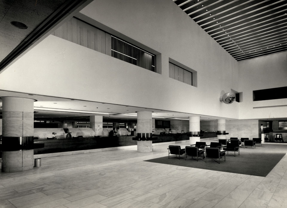
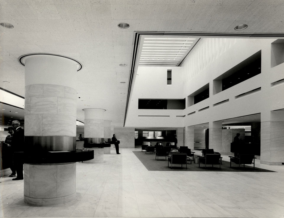
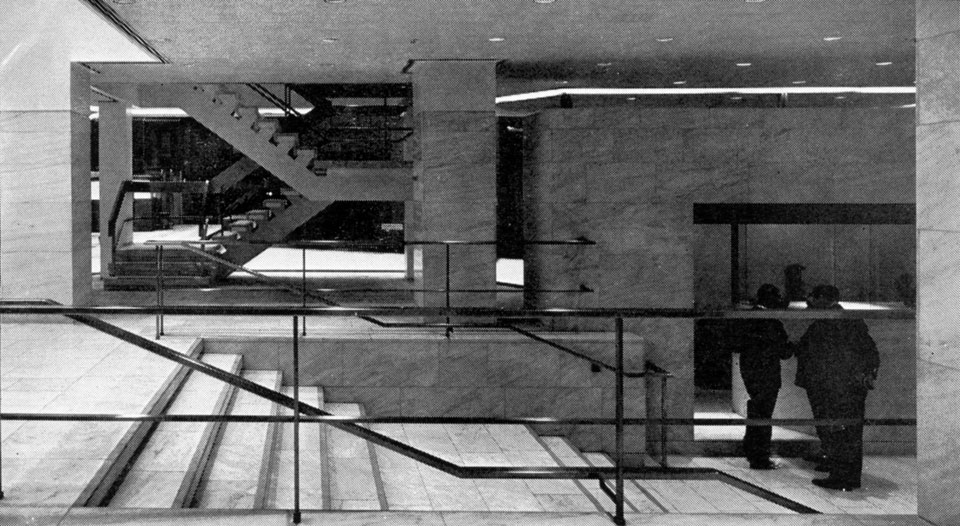
The banking hall was intended as the focus of the whole building and is positioned as such, not simply in its enclosure within the centre of the plan, but in the very deliberate sectional treatment in which the space was treated as a ‘stage’ and raised to provide ‘dignity and drama’; the principal actors were the public. The celebration of this central theatrical space was aptly exposed during the opening ceremony when, instead of the usual ribbon or unveiling, the invited dignitary, Lady Summers simply switched on the lights to ‘reveal’ the space. The entrance and approach was a controlled exercise in compression and release which began at street as one was invited to walk beneath the hulking, faceted solid, within an arcade space before being drawn into the building by the tapered plan of the gently rising stair. From the foyer it was possible to read all of the ground floor functions, its formal elements and their relationships. This is perhaps a product of the architect’s early suggestion that the banking hall be open plan, which was met with an emphatic ‘no’ from the client, but astutely predicted contemporary banking processes and environments.
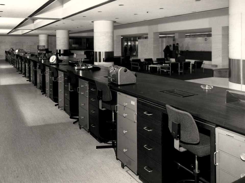
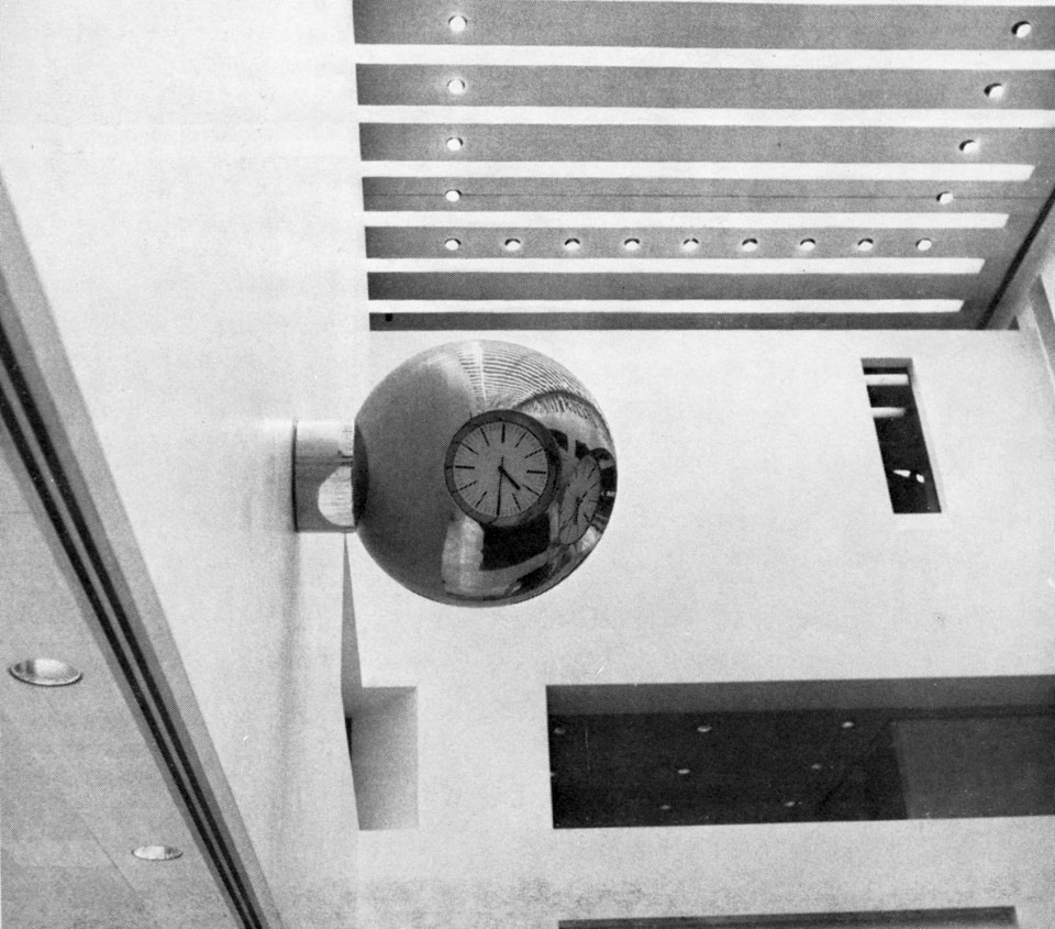
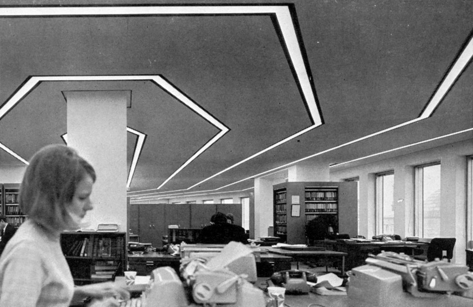
Whilst the glass security barricades were criticised for their obstructive presence, they did not detract from the regal landscape of the interior of the hall, the walls were lined with white Pentelicon marble and polished plaster and where the floor was not white marble its opulence was only intensified by the introduction of gold carpet inserts. The fixtures and fittings were a mixture of teak and high-grade mirror polished stainless steel, though the use of these as decorative elements was fastidiously designed out. The light fittings were all flush to the ceiling and incorporated air inlets and extracts so that the services may rescind into the fabric of the building and allow the served spaces to achieve an air of exclusivity akin to that of a luxury hotel where the frenetic energies that afford tranquillity are hidden from public sight. Photographs contemporary to the building’s completion afford the space a certain Kubrick-esque aesthetic, the gleaming white finishes and asymmetric hammerhead plans have an air of Space Odyssey and the spherical three-faced clock a slight nod toward the dystopian world of A Clockwork Orange. Perhaps the latter further reinforced by the iconography of the bowler hat and its association with banking.
The competition assessors were of the opinion that the scale and material choices applied by Casson and Conder would take their ‘place with dignity and restraint in the Manchester scene…without resorting to any of the current fashionable cliches’. This statement perhaps signifies an implicit trust in Casson who had been appointed Director of Architecture for the Festival of Britain at the age of 38 and was undoubtedly of the establishment and thus a safe bet for the conservative jury panel. It also belies the space-age effects employed and delivered in the principal internal space and it is this stark contrast between the controlled and serious monolithic envelope and the ethereal reflective translucency of the interior that makes this scheme cause for belated celebration and appreciation. Lost to time, the ghost of the banking hall lives on in small areas of visible marble that were not subsumed during reconfiguration, most prominently in the male executive bathroom; by appointment only.
